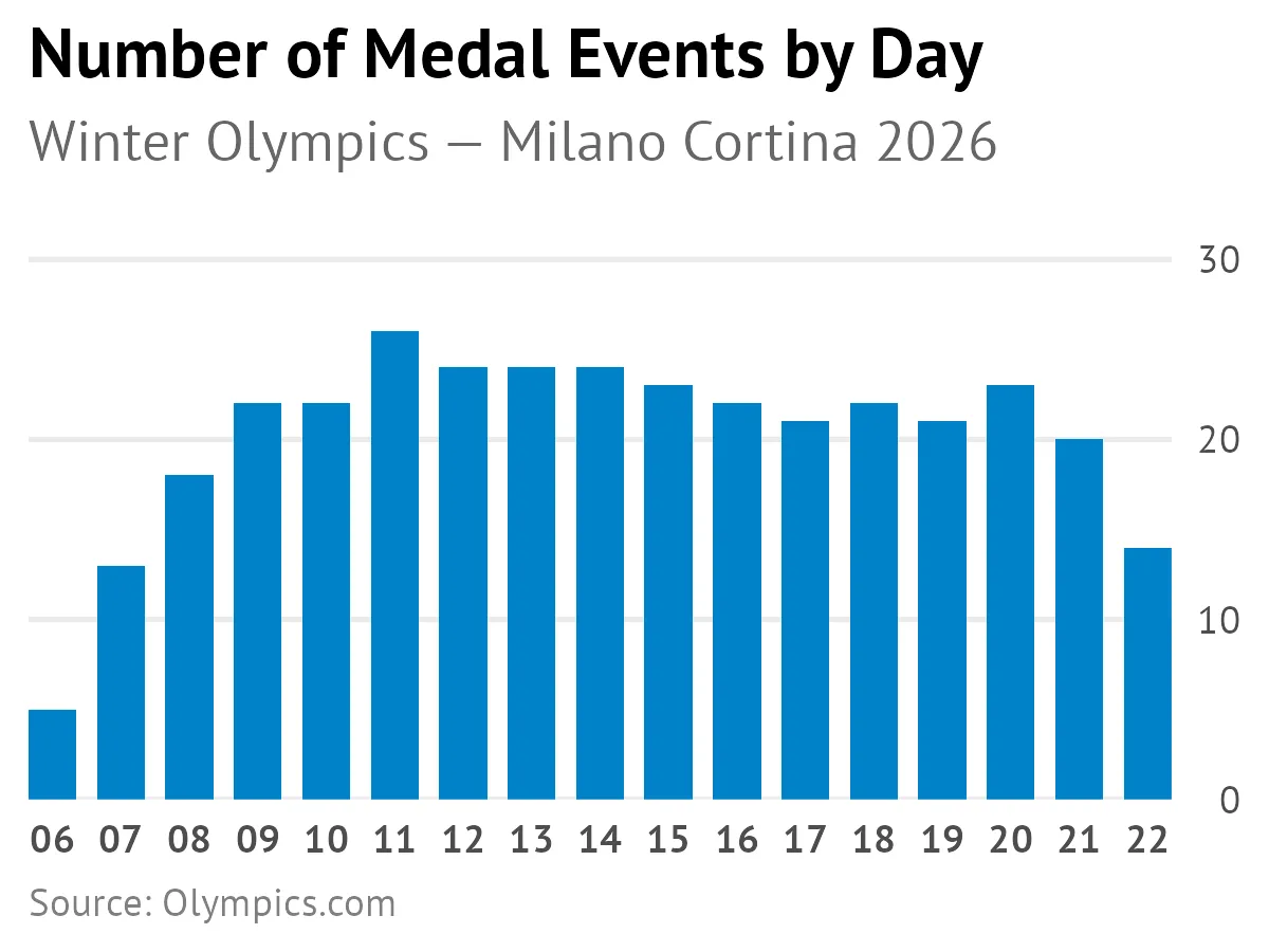
In this Tidy Tuesday visualization, I explored the schedule of medal events for the upcoming Winter Olympics in Milano Cortina 2026. The data shows the distribution of medal events across the competition days.
Here were some helpful functions and techniques I used.
Position y-axis on the right side
scale_y_continuous(position = "right")Format dates to show only day numbers
scale_x_date(date_breaks = "1 day", date_labels = "%d")Remove expansion padding from date axis
scale_x_date(expand = expansion(add = 0))Set custom y-axis expansion for better spacing
scale_y_continuous(expand = expansion(mult = c(0, 0.08)))All the code
library(tidyverse)

dataset_url <- "https://raw.githubusercontent.com/chendaniely/olympics-2026/refs/heads/main/data/final/olympics/olympics_events.csv"

df <- readr::read_csv(dataset_url)

schedule <- df |>
  group_by(date, discipline_name) |>
  summarize(
    total_events = n(),
    medal_events = sum(is_medal_event),
    .groups = "drop"
  ) |>
  arrange(date, discipline_name)

plot <- schedule |>
  filter(medal_events != 0) |>
  ggplot(aes(x = date, y = medal_events)) +
  geom_bar(stat = "identity", fill = "#0081C8", width = 0.7) +
  labs(
    title = "Number of Medal Events by Day",
    subtitle = "Winter Olympics — Milano Cortina 2026",
    x = NULL, y = NULL,
    caption = "Source: Olympics.com"
  ) +
  scale_y_continuous(
    expand = expansion(mult = c(0, 0.08)),
    limits = c(0, 30),
    position = "right"
  ) +
  scale_x_date(
    date_breaks = "1 day",
    date_labels = "%d",
    expand = expansion(add = 0)
  ) +
  theme_minimal(base_size = 13) +
  theme(
    plot.title = element_text(face = "bold", size = 16),
    plot.title.position = "plot",
    plot.subtitle = element_text(color = "gray40", margin = margin(b = 10)),
    plot.caption = element_text(color = "gray50", hjust = 0, size = 9),
    panel.grid.major.x = element_blank(),
    panel.grid.minor = element_blank(),
    axis.text.x = element_text(size = 9, face = "bold"),
    axis.text.y = element_text(size = 9),
    text = element_text(family = "PT Sans")
  )

ggsave("plot3.png", plot, width = 4, height = 3)