In this article, I wanted to share how I created this bar plot. It is a simple bar plot. However, it needed a few modifications from ggplot’s defaults.
Here were some helpful functions.
Remove the gap between the plot and the y axis label
scale_x_continuous(position = 'top', expand = expansion(0, 0))Left align the plot title and subtitle all the way to the left
theme(plot.title.position = "plot")Change all the fonts in one line
theme(text = element_text(family = "PT Sans"))Wrap the width of text
labs(title = str_wrap(..., width))All the code
library(tidyverse)
set.seed(16)
mtcars <- mtcars |>
rownames_to_column("model") |>
slice_sample(n = 10) |>
mutate(mpg = round(mpg, 0))
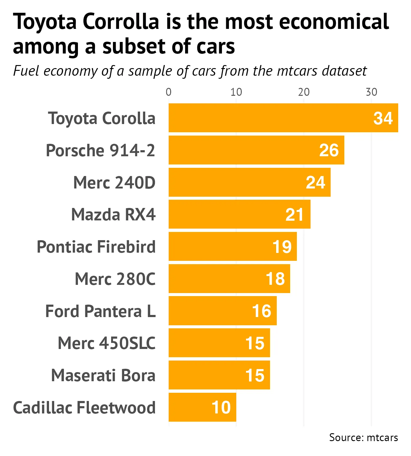
plot <- ggplot(mtcars, aes(x = mpg, y = fct_reorder(model, mpg), label = mpg)) +
geom_bar(stat = 'identity', fill = "orange") +
geom_text(hjust = 1.25, colour = 'white', fontface = 'bold', size = 5) +
labs(y = NULL,
x = NULL,
title = str_wrap("Toyota Corrolla is the most economical among a subset of cars", width = 40),
subtitle = "Fuel economy of a sample of cars from the mtcars dataset",
caption = "Source: mtcars") +
scale_x_continuous(position = 'top', expand = expansion(0, 0)) +
theme(plot.title.position = "plot",
plot.title = element_text(size = 18, face = "bold"),
plot.subtitle = element_text(size = 12, face = 'italic'),
plot.margin = margin(t = 10, b = 10, l = 10, r = 10),
panel.grid.major.y = element_blank(),
panel.background = element_blank(),
panel.grid.major.x = element_line(colour = 'whitesmoke'),
axis.ticks = element_blank(),
axis.text.y = element_text(margin = margin(r = 10), size = 14, face = 'bold'),
text = element_text(family = "PT Sans"))
ggsave("plot.png", width = 4.5, height = 5)